> ## Documentation Index
> Fetch the complete documentation index at: https://docs.ecomwize.io/llms.txt
> Use this file to discover all available pages before exploring further.
# Stars Toolbar
> Customize star rating elements with the stars toolbar -- switch between regular and Trustpilot styles.
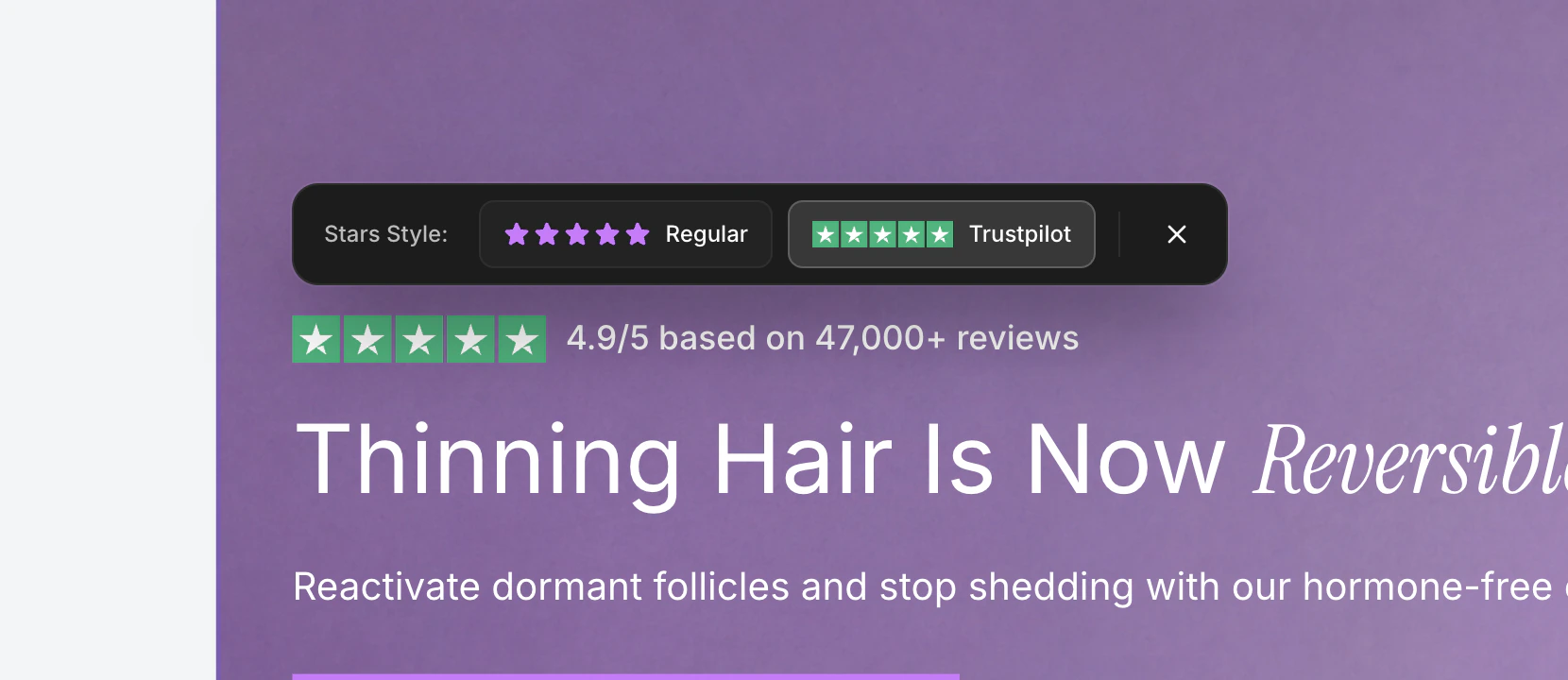
The stars toolbar appears when you click on a star rating element in a section. Star ratings are commonly used in testimonial sections, review highlights, and social proof blocks. The toolbar lets you quickly switch between star styles.
 ## Opening the Toolbar
Click on any star rating element in the canvas. The toolbar appears above the stars.
The toolbar closes when you click outside of it or press the **Escape** key.
## Star Style Options
The toolbar presents two star style options side by side, each with a visual preview:
### Regular Stars
The **Regular** option uses filled star icons. These are simple, clean five-pointed stars rendered in the star color defined for the element.
* Stars are rendered using a filled star icon.
* The star color is inherited from your brand style's star icon color setting.
* This style works well for generic review displays and custom-branded testimonials.
### Trustpilot Stars
The **Trustpilot** option uses the official Trustpilot star rating graphic. This displays the recognizable green Trustpilot stars that consumers associate with verified reviews.
* Uses the official Trustpilot 5-star SVG asset.
* Ideal when referencing Trustpilot reviews specifically.
* Provides instant visual credibility through brand recognition.
Use Trustpilot stars when your testimonials or reviews actually come from Trustpilot. For general reviews or custom testimonials, regular stars give you more design flexibility with your brand colors.
## How to Switch Styles
Click any star rating element in your section. The stars toolbar appears.
Click either the **Regular** or **Trustpilot** button. The currently active style has a highlighted border. The change applies immediately in the canvas.
Click the **X** button or click anywhere outside the toolbar to close it.
## Star Color
The star color for Regular stars is inherited from your brand style's **star icon color** setting. You can change this color in the Colors tab of your brand style editor.
Trustpilot stars use their official green color scheme and cannot be recolored, as they represent the Trustpilot brand.
## Where Stars Appear
Star rating elements are available in several section types:
Display customer review ratings alongside testimonial text.
Show aggregate ratings near headlines for social proof.
Display product review scores near pricing and CTA buttons.
Highlight customer satisfaction metrics with visual star ratings.
## Opening the Toolbar
Click on any star rating element in the canvas. The toolbar appears above the stars.
The toolbar closes when you click outside of it or press the **Escape** key.
## Star Style Options
The toolbar presents two star style options side by side, each with a visual preview:
### Regular Stars
The **Regular** option uses filled star icons. These are simple, clean five-pointed stars rendered in the star color defined for the element.
* Stars are rendered using a filled star icon.
* The star color is inherited from your brand style's star icon color setting.
* This style works well for generic review displays and custom-branded testimonials.
### Trustpilot Stars
The **Trustpilot** option uses the official Trustpilot star rating graphic. This displays the recognizable green Trustpilot stars that consumers associate with verified reviews.
* Uses the official Trustpilot 5-star SVG asset.
* Ideal when referencing Trustpilot reviews specifically.
* Provides instant visual credibility through brand recognition.
Use Trustpilot stars when your testimonials or reviews actually come from Trustpilot. For general reviews or custom testimonials, regular stars give you more design flexibility with your brand colors.
## How to Switch Styles
Click any star rating element in your section. The stars toolbar appears.
Click either the **Regular** or **Trustpilot** button. The currently active style has a highlighted border. The change applies immediately in the canvas.
Click the **X** button or click anywhere outside the toolbar to close it.
## Star Color
The star color for Regular stars is inherited from your brand style's **star icon color** setting. You can change this color in the Colors tab of your brand style editor.
Trustpilot stars use their official green color scheme and cannot be recolored, as they represent the Trustpilot brand.
## Where Stars Appear
Star rating elements are available in several section types:
Display customer review ratings alongside testimonial text.
Show aggregate ratings near headlines for social proof.
Display product review scores near pricing and CTA buttons.
Highlight customer satisfaction metrics with visual star ratings.