> ## Documentation Index
> Fetch the complete documentation index at: https://docs.ecomwize.io/llms.txt
> Use this file to discover all available pages before exploring further.
# Text Format Toolbar
> Learn how to use the text format toolbar to style text, change sizes, apply colors, and rewrite content with AI.
The text format toolbar is a floating contextual toolbar that appears whenever you select text in the canvas. It provides quick access to formatting options, size controls, alignment, color pickers, and AI rewriting -- all without leaving the canvas.
## How It Appears
The toolbar appears automatically when you:
* **Select part of a text block** (partial selection) -- Shows inline formatting options like bold, italic, and underline.
* **Click on a full text block** (whole block selected) -- Shows block-level controls like alignment, heading size, and AI rewriting.
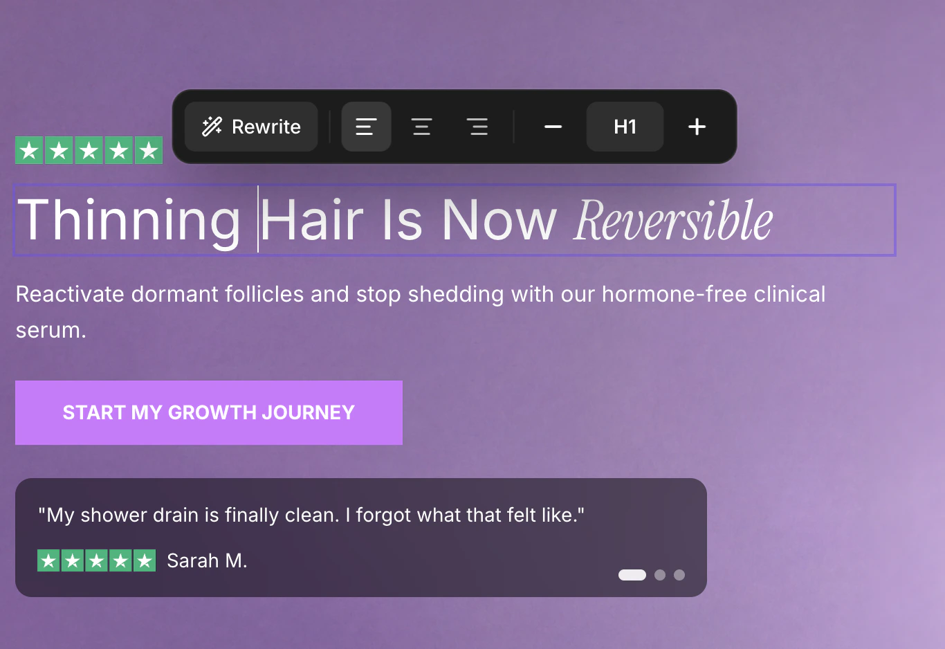 The toolbar is positioned above your selection and centers horizontally. It slides in with a smooth animation.
The toolbar closes automatically when you click outside of it, press the **Escape** key, or deselect the text.
## Partial Text Selection Controls
When you select a portion of text within a block, the toolbar shows inline formatting options:
### Text Formatting
| Button | Action | Shortcut |
| ------------- | --------------------------- | ------------ |
| **B** (Bold) | Toggle bold formatting | Cmd/Ctrl + B |
| *I* (Italic) | Toggle italic formatting | Cmd/Ctrl + I |
| U (Underline) | Toggle underline formatting | Cmd/Ctrl + U |
### Text Color
Click the **color circle** button to open the color picker. The circle displays the current text color of your selection.
The toolbar is positioned above your selection and centers horizontally. It slides in with a smooth animation.
The toolbar closes automatically when you click outside of it, press the **Escape** key, or deselect the text.
## Partial Text Selection Controls
When you select a portion of text within a block, the toolbar shows inline formatting options:
### Text Formatting
| Button | Action | Shortcut |
| ------------- | --------------------------- | ------------ |
| **B** (Bold) | Toggle bold formatting | Cmd/Ctrl + B |
| *I* (Italic) | Toggle italic formatting | Cmd/Ctrl + I |
| U (Underline) | Toggle underline formatting | Cmd/Ctrl + U |
### Text Color
Click the **color circle** button to open the color picker. The circle displays the current text color of your selection.
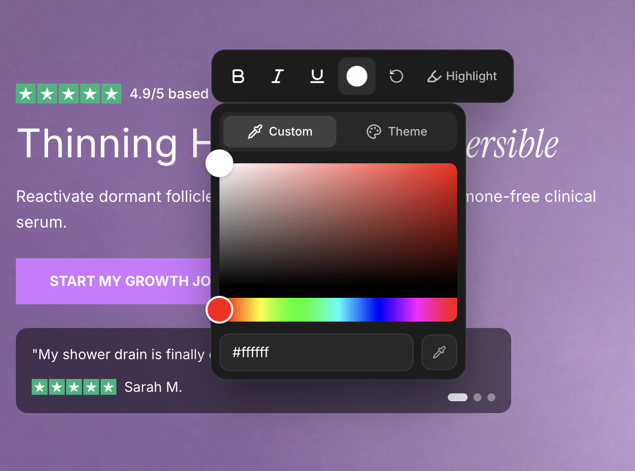 The color picker has two tabs:
A full color picker with:
* Saturation/brightness selector
* Hue slider
* Hex color input field (type a hex code like `#FF5733` and press Enter)
* Eyedropper tool (click to pick any color from your screen -- available in supported browsers)
Quick-access swatches from your brand style, organized into groups:
* **Brand colors** -- Primary, secondary, and tertiary brand colors
* **Text colors** -- Headline and body text colors
* **Button colors** -- Button background, hover, and text colors
Click any swatch to apply that color instantly.
### Reset Formatting
When your selected text contains formatting spans (bold, italic, color changes, etc.), a **reset** button (circular arrow icon) appears. Clicking it removes all inline formatting from the selection, returning the text to its default style.
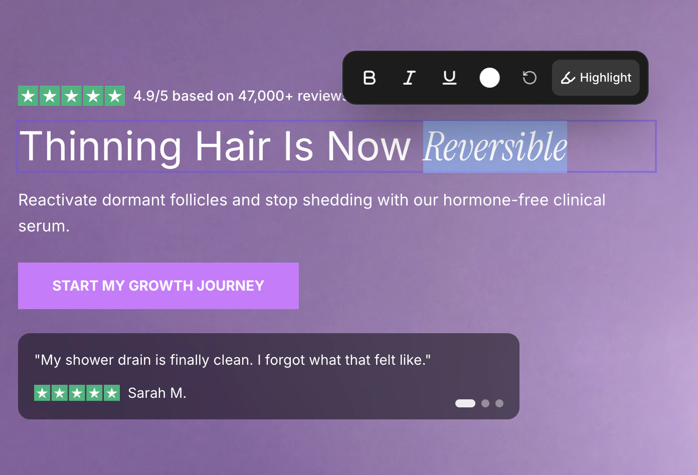
### Text Highlight Toggle
For heading text (H1-H6), if text highlighting is enabled in your brand style, a **Highlight** toggle appears. Activating it wraps the selected text in the highlight font configured in your brand style.
The color picker has two tabs:
A full color picker with:
* Saturation/brightness selector
* Hue slider
* Hex color input field (type a hex code like `#FF5733` and press Enter)
* Eyedropper tool (click to pick any color from your screen -- available in supported browsers)
Quick-access swatches from your brand style, organized into groups:
* **Brand colors** -- Primary, secondary, and tertiary brand colors
* **Text colors** -- Headline and body text colors
* **Button colors** -- Button background, hover, and text colors
Click any swatch to apply that color instantly.
### Reset Formatting
When your selected text contains formatting spans (bold, italic, color changes, etc.), a **reset** button (circular arrow icon) appears. Clicking it removes all inline formatting from the selection, returning the text to its default style.
### Text Highlight Toggle
For heading text (H1-H6), if text highlighting is enabled in your brand style, a **Highlight** toggle appears. Activating it wraps the selected text in the highlight font configured in your brand style.
 ## Whole Block Selection Controls
When an entire text block is selected, the toolbar switches to block-level controls:
### AI Rewrite Button
The **Rewrite** button (with the sparkle icon) opens the AI chatbox with the selected text pre-filled, allowing you to rewrite the content using AI prompts.
### Text Alignment
Three alignment buttons control the horizontal alignment of the text block:
| Button | Alignment |
| ------------ | ----------------------------- |
| Left align | Aligns text to the left edge |
| Center align | Centers text horizontally |
| Right align | Aligns text to the right edge |
The currently active alignment is highlighted.
Alignment controls only appear for text blocks that support alignment. Some section elements have fixed alignment determined by the section layout.
### Heading Size Controls
The heading size controls let you change the typographic level of the text block:
* **Minus button** (-) -- Decrease size (e.g., H1 becomes H2, P1 becomes P2)
* **Size dropdown** -- Shows the current size level. Click to open a dropdown with all nine options:
* **H1** through **H6** -- Heading levels (largest to smallest)
* **P1** through **P3** -- Paragraph levels (largest to smallest)
* **Plus button** (+) -- Increase size (e.g., H3 becomes H2, P2 becomes P1)
The actual pixel sizes for each heading and paragraph level are controlled by your brand style. Changing the level here changes the semantic size, and your brand style determines the exact font size for desktop and mobile.
## Button Text
When you select text inside a button element, the toolbar shows only the **Rewrite** button. Other formatting options are hidden since button text inherits its styling from the brand style (button font size, weight, and color).
## Read-Only Fields
For fields that come from external data (like Shopify product titles and prices), the toolbar shows:
* **Edit in Shopify** button -- Opens the Shopify admin in a new tab where you can edit the source content.
* **Size controls** -- Minus, size dropdown, and plus buttons to adjust how the field is displayed in the builder.
Formatting options like bold, italic, and color are not available for read-only fields.
## Whole Block Selection Controls
When an entire text block is selected, the toolbar switches to block-level controls:
### AI Rewrite Button
The **Rewrite** button (with the sparkle icon) opens the AI chatbox with the selected text pre-filled, allowing you to rewrite the content using AI prompts.
### Text Alignment
Three alignment buttons control the horizontal alignment of the text block:
| Button | Alignment |
| ------------ | ----------------------------- |
| Left align | Aligns text to the left edge |
| Center align | Centers text horizontally |
| Right align | Aligns text to the right edge |
The currently active alignment is highlighted.
Alignment controls only appear for text blocks that support alignment. Some section elements have fixed alignment determined by the section layout.
### Heading Size Controls
The heading size controls let you change the typographic level of the text block:
* **Minus button** (-) -- Decrease size (e.g., H1 becomes H2, P1 becomes P2)
* **Size dropdown** -- Shows the current size level. Click to open a dropdown with all nine options:
* **H1** through **H6** -- Heading levels (largest to smallest)
* **P1** through **P3** -- Paragraph levels (largest to smallest)
* **Plus button** (+) -- Increase size (e.g., H3 becomes H2, P2 becomes P1)
The actual pixel sizes for each heading and paragraph level are controlled by your brand style. Changing the level here changes the semantic size, and your brand style determines the exact font size for desktop and mobile.
## Button Text
When you select text inside a button element, the toolbar shows only the **Rewrite** button. Other formatting options are hidden since button text inherits its styling from the brand style (button font size, weight, and color).
## Read-Only Fields
For fields that come from external data (like Shopify product titles and prices), the toolbar shows:
* **Edit in Shopify** button -- Opens the Shopify admin in a new tab where you can edit the source content.
* **Size controls** -- Minus, size dropdown, and plus buttons to adjust how the field is displayed in the builder.
Formatting options like bold, italic, and color are not available for read-only fields.