> ## Documentation Index
> Fetch the complete documentation index at: https://docs.ecomwize.io/llms.txt
> Use this file to discover all available pages before exploring further.
# Text Highlights
> Use text highlights to emphasize key words and phrases with a special font treatment.
Text highlights are a typographic styling feature that lets you emphasize specific words or phrases in your headings using a distinct font. This is commonly used by e-commerce brands to draw attention to key selling points, product names, or emotional trigger words.
## What Are Text Highlights?
A text highlight applies a different font (and optionally a different weight) to selected text within a heading. Unlike bold or italic formatting, highlights use a completely separate font family -- often a script, handwritten, or decorative font that contrasts with your primary heading font.
For example, if your heading font is a clean sans-serif like Inter, your highlight font might be a script font like Playfair Display Italic, creating a visual accent on key words.
## Enabling Highlights
Text highlights must be enabled in your brand style before they can be used in sections.
Navigate to your brand style editor from the sidebar or page settings.
Find the **Text Highlight** section and toggle it on.
Select the font you want to use for highlighted text. This should be a Google Font or custom font that contrasts with your heading font.
Choose the font weight for highlighted text (e.g., Regular, Bold, or Italic).
## Using Highlights in the Builder
Once highlights are enabled in your brand style, you can apply them from the text format toolbar:
Click on a heading element (H1-H6) in the canvas to select it.
In the floating text toolbar, click the **Highlight** button (highlighter icon). The button shows its active state when the selection is already highlighted.
Click the Highlight button again to remove the highlight and revert to the standard heading font.
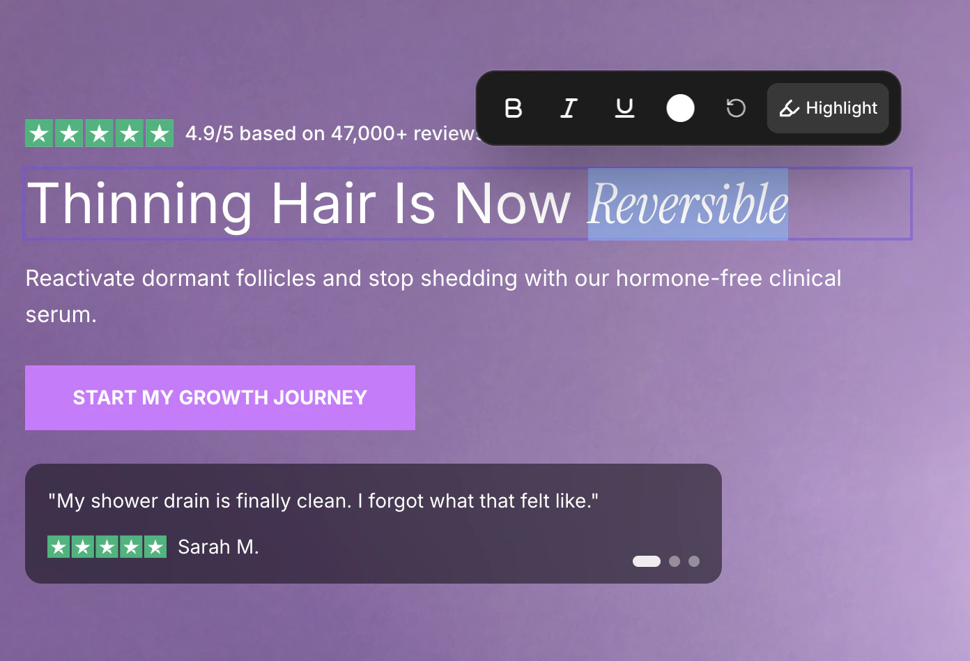 The Highlight toggle only appears for heading elements (H1 through H6) when highlighting is enabled in your brand style. It does not appear for paragraph text (P1-P3) or when highlighting is disabled.
## How Highlights Render
When text is highlighted, the highlight font and weight are applied to the selected words. All other properties (size, color, alignment) remain inherited from the parent heading. This means highlighted text stays the same size and color as the surrounding heading -- only the font family and weight change.
## Tips for Effective Highlights
The highlight font should be visually distinct from your heading font. If your headings use a geometric sans-serif, try a serif or script font for highlights. The contrast is what makes the emphasis work.
Highlight one or two key words per heading, not entire sentences. The impact comes from the contrast between highlighted and non-highlighted text. Over-highlighting dilutes the effect.
Highlight words that create emotional resonance: product benefits, transformative language, or unique selling propositions. Words like "transform," "natural," "clinically proven," or your brand name are strong candidates.
Script and decorative fonts can sometimes be harder to read at small sizes. Always preview your highlights in mobile view to ensure readability.
## Highlights in Published Pages
When you publish a page to Shopify, text highlights are preserved. The highlight font is loaded automatically, and the rendered output on your Shopify store matches what you see in the builder.
If you publish a page with **Allow content editing in Shopify** enabled, the highlight font styling is **not preserved** on highlighted text. This is because the Shopify theme editor does not support inline font styling within text fields. For pages where highlight fonts are important to your design, publish without the content editing option enabled.
The Highlight toggle only appears for heading elements (H1 through H6) when highlighting is enabled in your brand style. It does not appear for paragraph text (P1-P3) or when highlighting is disabled.
## How Highlights Render
When text is highlighted, the highlight font and weight are applied to the selected words. All other properties (size, color, alignment) remain inherited from the parent heading. This means highlighted text stays the same size and color as the surrounding heading -- only the font family and weight change.
## Tips for Effective Highlights
The highlight font should be visually distinct from your heading font. If your headings use a geometric sans-serif, try a serif or script font for highlights. The contrast is what makes the emphasis work.
Highlight one or two key words per heading, not entire sentences. The impact comes from the contrast between highlighted and non-highlighted text. Over-highlighting dilutes the effect.
Highlight words that create emotional resonance: product benefits, transformative language, or unique selling propositions. Words like "transform," "natural," "clinically proven," or your brand name are strong candidates.
Script and decorative fonts can sometimes be harder to read at small sizes. Always preview your highlights in mobile view to ensure readability.
## Highlights in Published Pages
When you publish a page to Shopify, text highlights are preserved. The highlight font is loaded automatically, and the rendered output on your Shopify store matches what you see in the builder.
If you publish a page with **Allow content editing in Shopify** enabled, the highlight font styling is **not preserved** on highlighted text. This is because the Shopify theme editor does not support inline font styling within text fields. For pages where highlight fonts are important to your design, publish without the content editing option enabled.