> ## Documentation Index
> Fetch the complete documentation index at: https://docs.ecomwize.io/llms.txt
> Use this file to discover all available pages before exploring further.
# Desktop and Mobile Preview
> Toggle between desktop and mobile views to ensure your landing page looks great on all devices before publishing.
## Overview
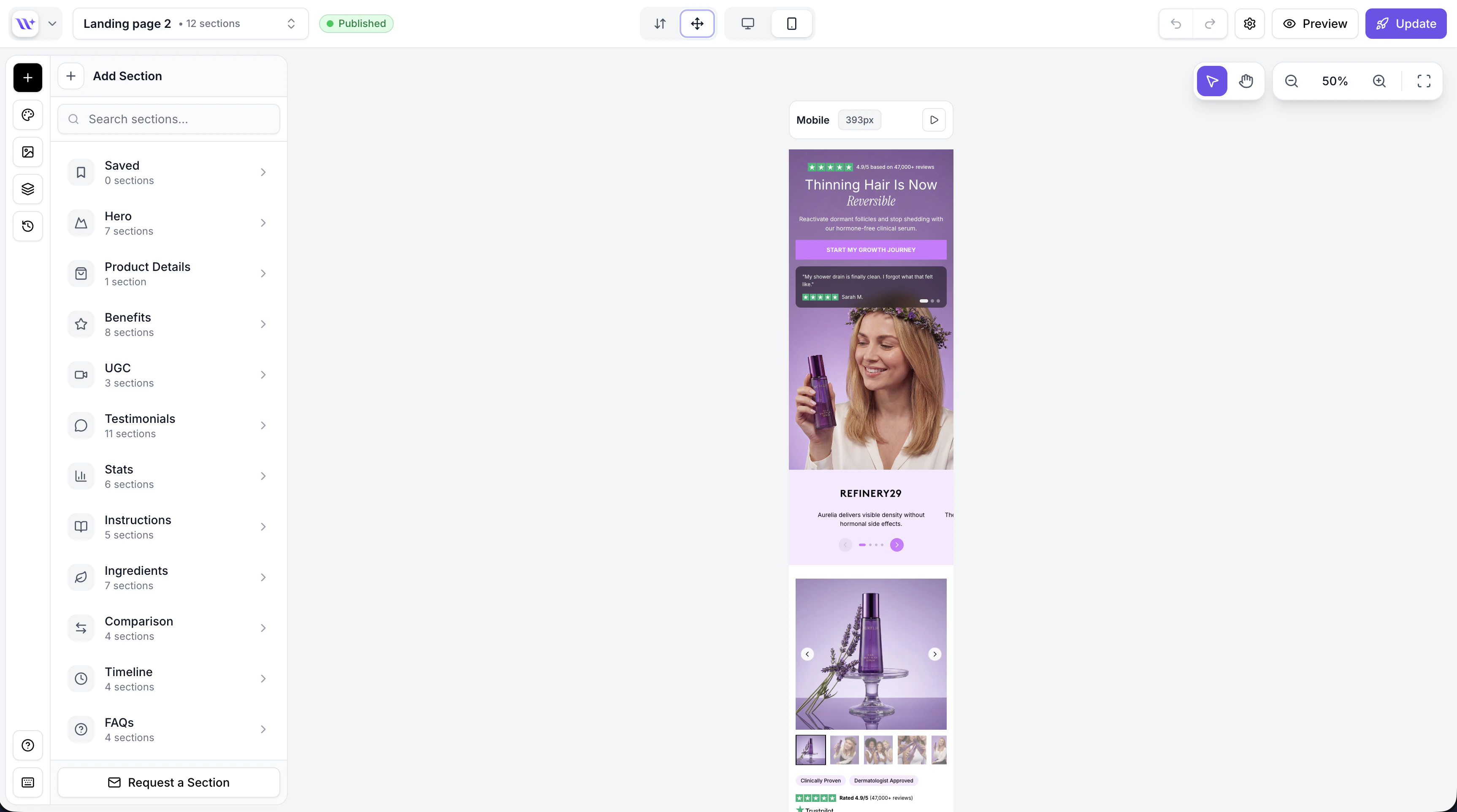
Every landing page you build with EcomWize needs to look great on both desktop and mobile devices. The builder includes a desktop/mobile toggle that lets you switch between the two views instantly, so you can design and preview your page for each screen size without leaving the editor.
## Switching between views
In the top toolbar of the builder, you will find two icons:
* **Monitor icon** -- Desktop view
* **Smartphone icon** -- Mobile view
Click either icon to switch the canvas to that view. The currently active view is highlighted.
 Get in the habit of checking the mobile view frequently as you build. Most Shopify stores see 60-80% of traffic from mobile devices, so the mobile experience is critical for conversions.
## What changes between views
When you switch between desktop and mobile, several aspects of your sections adapt automatically:
### Canvas width
| View | Canvas width |
| ------- | ---------------------------------------------------- |
| Desktop | Full page width (matches your brand style max width) |
| Mobile | Narrow width simulating a smartphone screen |
The canvas visually resizes to reflect the target screen size, giving you an accurate representation of how your page will look on each device.
### Typography
Your brand style defines separate font sizes for desktop and mobile:
* **Heading sizes** -- Desktop headings are typically larger; mobile headings scale down for readability
* **Body text sizes** -- Body text may also adjust between desktop and mobile
* **Line heights** -- Automatically optimized for each screen size
These sizes are set in your [brand style](/brand-styles/creating-brand-styles) and apply globally across all sections.
### Padding and spacing
Sections use responsive padding that adapts to the screen size:
* **Horizontal padding** -- Wider on desktop, narrower on mobile to maximize content space
* **Vertical padding** -- May adjust to keep sections proportional on smaller screens
* **Section spacing** -- The gap between sections can differ between views
### Layout changes
Many sections adjust their internal layout based on the view:
* Multi-column layouts on desktop often stack into a single column on mobile
* Image and text side-by-side arrangements may become stacked
* Grid layouts reduce the number of columns
* Large hero images may adjust their aspect ratio
Layout responsiveness is built into each section's design. You do not need to manually configure separate desktop and mobile layouts -- the sections handle this automatically based on your brand style settings.
## Editing in mobile view
You can edit your page while in mobile view. All the same editing tools are available:
* Click sections to select them
* Edit text inline
* Use the config panel to change properties
* Drag and drop to reorder sections
* Use the AI chatbox to rewrite content
Changes you make in mobile view affect the section across both views -- there is no concept of "desktop-only" or "mobile-only" content. The section content is the same; only the visual presentation adapts.
## Testing your page before publishing
Before publishing your page, we recommend the following workflow:
Scroll through your entire page in desktop view. Check that:
* Text is readable and properly formatted
* Images are properly sized and positioned
* Sections flow together naturally
* Call-to-action buttons are prominent
Toggle to mobile view and scroll through the same page. Check that:
* Text does not overflow or become too small
* Images scale properly and are not cut off
* Buttons are large enough to tap
* Sections are not too tall or too short
* The overall reading experience is comfortable
Toggle **preview mode** (eye icon in the toolbar) to hide all editing UI. This gives you the cleanest possible view of your page, exactly as visitors will see it. Test both desktop and mobile in preview mode.
Pay particular attention to heading sizes on mobile. If headings look too large or too small, adjust the mobile font sizes in your [brand style](/brand-styles/typography).
While the builder preview is very close to what your published page will look like, always verify the final result on your actual Shopify store after publishing. Minor differences in browser rendering or theme styles may affect the appearance.
## Responsive brand style properties
The following brand style properties have separate desktop and mobile values:
| Property | Desktop | Mobile |
| ------------------ | -------------------------- | ------------------------- |
| Heading font sizes | H1-H6 desktop sizes | H1-H6 mobile sizes |
| Body font sizes | P1-P3 desktop sizes | P1-P3 mobile sizes |
| Horizontal padding | Desktop horizontal padding | Mobile horizontal padding |
| Vertical padding | Desktop vertical padding | Mobile vertical padding |
You can adjust these in the [Brand Style editor](/brand-styles/creating-brand-styles) to fine-tune how your page appears on each device.
Configure desktop and mobile font sizes.
Learn about preview mode for clean page previews.
Get in the habit of checking the mobile view frequently as you build. Most Shopify stores see 60-80% of traffic from mobile devices, so the mobile experience is critical for conversions.
## What changes between views
When you switch between desktop and mobile, several aspects of your sections adapt automatically:
### Canvas width
| View | Canvas width |
| ------- | ---------------------------------------------------- |
| Desktop | Full page width (matches your brand style max width) |
| Mobile | Narrow width simulating a smartphone screen |
The canvas visually resizes to reflect the target screen size, giving you an accurate representation of how your page will look on each device.
### Typography
Your brand style defines separate font sizes for desktop and mobile:
* **Heading sizes** -- Desktop headings are typically larger; mobile headings scale down for readability
* **Body text sizes** -- Body text may also adjust between desktop and mobile
* **Line heights** -- Automatically optimized for each screen size
These sizes are set in your [brand style](/brand-styles/creating-brand-styles) and apply globally across all sections.
### Padding and spacing
Sections use responsive padding that adapts to the screen size:
* **Horizontal padding** -- Wider on desktop, narrower on mobile to maximize content space
* **Vertical padding** -- May adjust to keep sections proportional on smaller screens
* **Section spacing** -- The gap between sections can differ between views
### Layout changes
Many sections adjust their internal layout based on the view:
* Multi-column layouts on desktop often stack into a single column on mobile
* Image and text side-by-side arrangements may become stacked
* Grid layouts reduce the number of columns
* Large hero images may adjust their aspect ratio
Layout responsiveness is built into each section's design. You do not need to manually configure separate desktop and mobile layouts -- the sections handle this automatically based on your brand style settings.
## Editing in mobile view
You can edit your page while in mobile view. All the same editing tools are available:
* Click sections to select them
* Edit text inline
* Use the config panel to change properties
* Drag and drop to reorder sections
* Use the AI chatbox to rewrite content
Changes you make in mobile view affect the section across both views -- there is no concept of "desktop-only" or "mobile-only" content. The section content is the same; only the visual presentation adapts.
## Testing your page before publishing
Before publishing your page, we recommend the following workflow:
Scroll through your entire page in desktop view. Check that:
* Text is readable and properly formatted
* Images are properly sized and positioned
* Sections flow together naturally
* Call-to-action buttons are prominent
Toggle to mobile view and scroll through the same page. Check that:
* Text does not overflow or become too small
* Images scale properly and are not cut off
* Buttons are large enough to tap
* Sections are not too tall or too short
* The overall reading experience is comfortable
Toggle **preview mode** (eye icon in the toolbar) to hide all editing UI. This gives you the cleanest possible view of your page, exactly as visitors will see it. Test both desktop and mobile in preview mode.
Pay particular attention to heading sizes on mobile. If headings look too large or too small, adjust the mobile font sizes in your [brand style](/brand-styles/typography).
While the builder preview is very close to what your published page will look like, always verify the final result on your actual Shopify store after publishing. Minor differences in browser rendering or theme styles may affect the appearance.
## Responsive brand style properties
The following brand style properties have separate desktop and mobile values:
| Property | Desktop | Mobile |
| ------------------ | -------------------------- | ------------------------- |
| Heading font sizes | H1-H6 desktop sizes | H1-H6 mobile sizes |
| Body font sizes | P1-P3 desktop sizes | P1-P3 mobile sizes |
| Horizontal padding | Desktop horizontal padding | Mobile horizontal padding |
| Vertical padding | Desktop vertical padding | Mobile vertical padding |
You can adjust these in the [Brand Style editor](/brand-styles/creating-brand-styles) to fine-tune how your page appears on each device.
Configure desktop and mobile font sizes.
Learn about preview mode for clean page previews.